- How To Install the Astra Theme
- System Requirement for Astra Theme
- What Is a Child Theme and How To Install It for Astra?
- Manually Install Astra via FTP
- How to Update Astra Theme Manually?
- Automatic Beta Updates for Astra
- Astra 4.2.0-beta.1 : Migrations & Backwards Compatibility
- Know More about Astra Beta Versions? How to Download and Use?
- How to Create a Multisite Network and Use Astra Child Theme On It
- Getting Started with Astra Pro Addon Plugin
- What is Astra Pro Add on?
- How to Install Astra Pro Plugin?
- How to Get License Key of Astra Pro?
- How to Activate Astra Pro Addon License?
- Getting error – The package could not be installed. The theme is missing the style.css stylesheet?
- Why Can’t I Access Astra Pro Features After Purchasing the Pro Version?
- Do Not See License Activation Form for Astra Pro Addon Plugin?
- How to Fix “Sorry, You Are Not Allowed To Access This Page” Error In Astra Pro
- How To Manage Sidebars in Free Astra Theme
- Understanding Sidebar Style in Astra Theme: Customizing Your Sidebar’s Look
- Sticky Sidebar
- Scroll To Top
- How to Display a Breadcrumb Anywhere within a Page or Post with Shortcode?
- Find the Way With Breadcrumbs
- How to Change the “HOME” String in Breadcrumbs
- How to Switch From Existing Breadcrumb to New Trail?
- How To Add Breadcrumbs in WordPress Website with Astra
- How To Create a Header With Astra Header Builder
- How To Create Mobile Header With Astra Header Builder
- How To Create a Footer With Astra Footer Builder
- Why Is My Logo Blurry?
- Astra – Customize the Submenu
- FAQs – Astra Header/Footer Builder
- Elements in Header/Footer Builder With Astra Theme and Astra Pro
- Add Multiple Elements in Header Footer Builder
- FAQs – Astra Header/Footer Builder – Existing Customers
- Blog Overview
- Blog / Archive
- Single Post
- How to Display “Last Updated” instead of “Published” Date
- Display Related Posts on Single Blog Post
- The Recommended Size for Featured Image
- How to remove an Author’s name from a Single Blog Post?
- How to Remove Astra Post Excerpt from the Post Archive
- Add Last Updated or Published Date to Blog Posts
- WooCommerce Integration Overview in Free Astra Theme
- How to Create a Sticky Sidebar for Your WooCommerce Shop Page
- Set WooCommerce Shop Page as Homepage
- WooCommerce hooks
- Display Featured Products instead of Empty Cart
- How to Set the “Review” Tab as the Default Active Tab in WooCommerce
- How to Add Additional Content on the My Account Login Page
- How to Change the Background Color of Product & Shop Pages in Astra?
- Blog Pro Overview
- Blog / Archive with Blog Pro
- Single Post with Blog Pro
- How to Display “Last Updated” instead of “Published” Date
- How to add custom post type with the Astra theme
- Social Sharing
- Featured Image Options for Single Banner Layouts
- Add Post Filter on Blog Archive Page
- How to change “Leave a Comment” string in WordPress
- Astra WooCommerce Mini Cart Shortcode
- WooCommerce Module Overview
- How to Design a Product Catalog Page or Shop Page Using WooCommerce Module in Astra?
- Single Product WooCommerce
- Checkout Page WooCommerce
- Colors & Background Options For WooCommerce
- Typography Options for WooCommerce
- Off-Canvas Sidebar for WooCommerce Shop Page
- Quick View for WooCommerce Products
- How to Disable EDD Inbuilt Styling?
- How to Add Download Archive Pages to the Menu When Using Astra with EDD?
- How to Add EDD Cart in Header? (Old Astra Header)
- How to Display a Mini Cart Anywhere Using Shortcode? (Astra and EDD)
- EDD – Easy Digital Downloads Module Overview
- General – EDD Module Options
- Product Archive – EDD Module Options
- Single Product – EDD Module Options
- Checkout Page – EDD Module Options
- How To Translate Site Builder With WPML?
- How To Make Astra Multilingual With WPML
- How to Translate Astra Strings with WPML?
- Translating the Advanced Custom Fields with WPML
- How to Turn Astra Website Multilingual with Polylang?
- How to Translate Categories, Tags, and Astra Strings with Polylang
- How to Turn Astra Website Multilingual with TranslatePress?
- How to Translate Astra Theme / Plugins in Your Own Language using GlotPress?
- Translate Site Builder Layouts Using Polylang
- Footer Custom Text Helper Strings
- Does Astra support Beaver Themer Plugin?
- Support Mega Menu for all the Header Builder Menu component
- How To Disable Right Click in WordPress
- Increasing the PHP Memory Limit of Your Website
- How to Resolve Fatal Error: Call to Undefined function ctype_xdigit()
- How To Disable Header or Footer for a Landing Page or Post
- Where Does Astra Primary Color Setting Take Effect?
- How To Adjust the Width of Your Sidebar
- How to Manage License on Store?
- How to Renew Yearly License?
- How Do License Upgrades Work?
- How To Update Your Payment Method?
- How to Process Refund Requests?
- How to Apply For Brainstorm Force Affiliate Program? (Become Astra Affiliate)
- Frequently Asked Questions – VIP Priority Support
- How do I check my Support Ticket History?
- How to Change the Default Astra Strings
- Using Hooks in Astra
- How to Change the “Scroll To Top” Icon in Astra?
- Astra Pro WP CLI Commands
- How to Add Custom PHP Code?
- How to Disable the Loading of Astra’s Default Font File? (Astra.woff)
- Disable Featured Image on Posts, Pages, or Other Post Types
- Change Sidebar Widget Title Heading Tag
- Disable Astra’s Native AMP Functionality
- How to Change Website Logo Destination URL
- Remove Primary Navigation Menu with Hook
- Change the Astra Header Breakpoint Width
- How to Disable Primary Header?
- Add Title attribute to Header Background Image as a Substitute for Alt Text
- How to Change HTML tag for Site Title and Tagline?
- How to Change the Heading Tag for the Page/Post Titles?
- How to Change the “Search Results For” String
- Change Placeholder for Search Box (Old Astra Header)
- How to Display “Last Updated” instead of “Published” Date
- How to Change Previous and Next Link Text from a Single Blog Post?
- How to Remove Featured Image Link on Archive Page?
- Filter to Remove Link From Featured Images on Blog Page
- Blog Featured Image Size Not Working / Error in Image Processing Library
- Filters to Support CPTs for Blog Meta and Single Blog Meta
- How To Change Navigation Links Text for a Blog Archive?
- How to Display the Post Category as a Related Posts Title?
- Change “Leave A Comment” title tag
- Change Woocommerce Out of Stock Text
- How to Disable Product Quantity (Plus-Minus) Buttons?
- How to Modify/Change the Quick View text?
- Filter to Add Global Button Settings Support for WooCommerce Buttons
- Change the “Shopping Cart” Text for WooCommerce & EDD Mobile Header Cart
- Fix Woocommerce Cart Becoming Transparent With Header Builder
- Restrict Search Results to WooCommerce Products Only
- How To Hide Quantity Number When the Woocommerce Cart Is Empty?
- Remove Astra Customization for WooCommerce
- How to Add Custom CSS Code Without Editing Theme Files?
- How to Highlight a Certain Menu Item?
- How to Design Bullets & Lists?
- Dim Content on Menu Hover
- How to add custom CSS and JavaScript to Astra theme
- Mobile Breakpoint Causes Issues with Transparent Header Menu Color
- Display Coupon Field on Checkout & Cart Pages
- Fix Swap Sections Not Working on Mobile (Old Astra Header)
- How to Remove Google Fonts Suggestions in Astra Theme?
- Remove default stretched block layout spacing
- How to Change the Logo on Specific Pages?
- How to remove horizontal & vertical gallery layouts from a single product page?
- Introducing New Filter to Enable/Disable Rank-Math Theme Support
- Enable/Disable YouTube videos from Astra admin dashboard
- How to Fix the Line Height Unit being converted to “EM”?
- How to Change WordPress Post labels to Projects
- Fix for – The PCLZIP_ERR_BAD_FORMAT (-10) Error
- Host Google Fonts Locally – Performance Is the Key
- Fix for – Parse error: syntax error, unexpected T_FUNCTION
- How to fix Fatal Error / White Screen of Death?
- Fix for- cURL error 51: SSL: no alternative certificate subject name matches target host name ‘websitedemos.net’
- ‘The preview could not be loaded’ Pop Up with Astra and Elementor
- Troubleshooting Steps ( with Health Check & Troubleshooting plugin )
- How to Deal with Update Issues in Astra Theme and Astra Pro Addon?
- Blog Featured Image Size Not Working / Error in Image Processing Library
Using the Color Switcher/Dark Mode Widget in the Header
A few updates back, we introduced the Dark Color Palette as part of Astra’s global color settings—allowing you to set the dark color scheme for your website.
Building on that, we’ve now introduced the Color Switcher widget in Astra Pro version 4.10.0 — a simple yet powerful addition that lets your website visitors toggle between two custom color palettes, such as light and dark modes, with just one click.
Fully integrated into the Header Builder, this widget requires no extra plugins or custom code. It’s designed to enhance accessibility, align with user preferences, and deliver a more modern, personalized browsing experience, making your site not only more functional but also more user-friendly.
What is the Color Switcher?
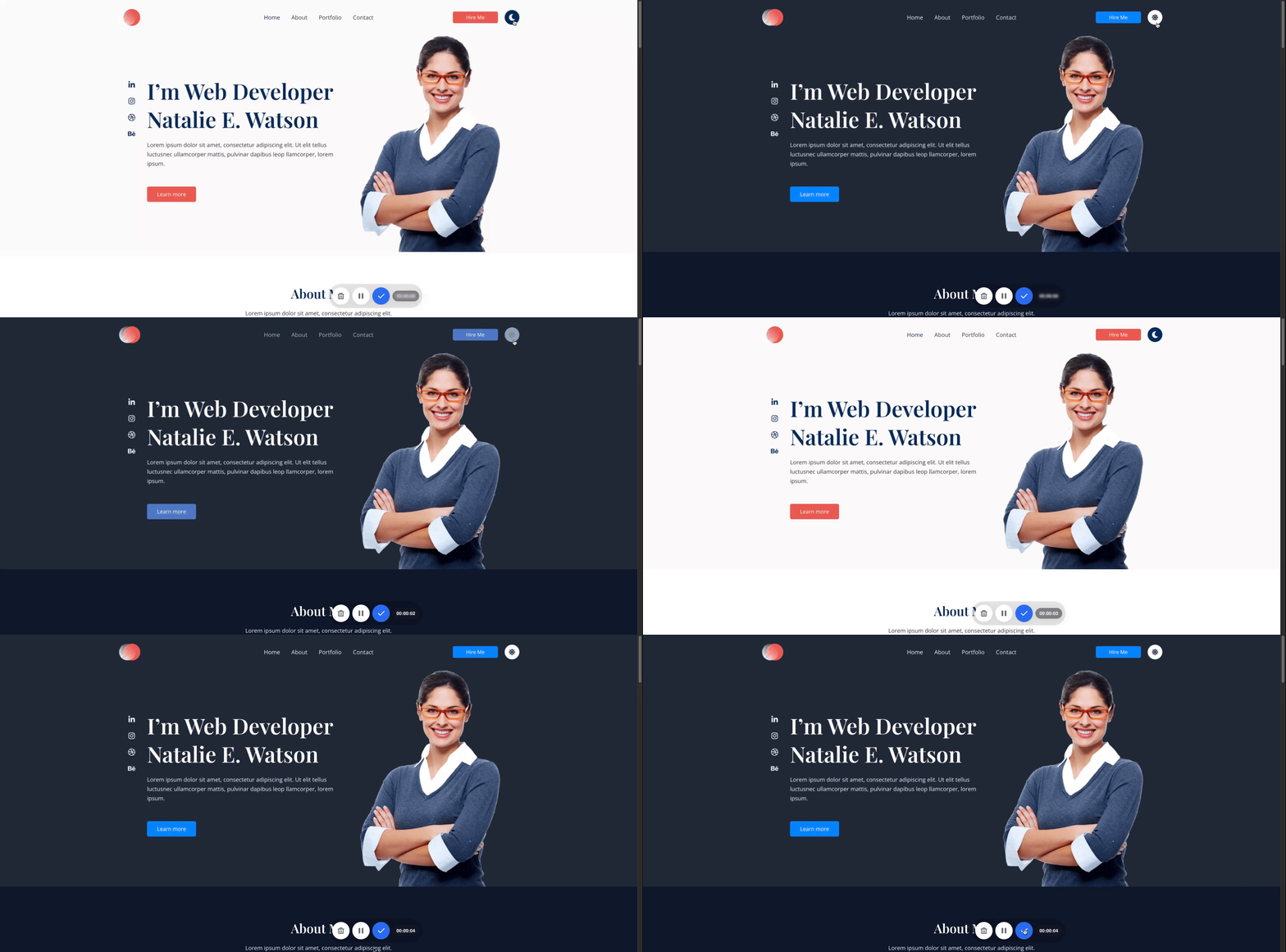
The Color Switcher Widget is a customizable toggle button that you can place in your website’s header. When clicked, it switches your site between two predefined color palettes:
- ✅ A Default Palette – usually your site’s standard (light) mode.
- ✅ An Alternate Palette – often used to create a Dark Mode experience.
This feature is completely native to Astra Pro, optimized for performance, and styled to match your website’s design.
What You’ll Need
Before setting it up, make sure:
- ✅ You’re using the Astra Theme.
- ✅ You have the Astra Pro Addon plugin installed and activated.
- ✅ Both the theme and the plugin are up to date with v4.10.0.
How to Add and Use the Color Switcher
Step 1: Open the Astra Customizer
- In your WordPress dashboard, go to Appearance > Customize
- Open the Header Builder
Step 2: Add the Color Switcher Widget
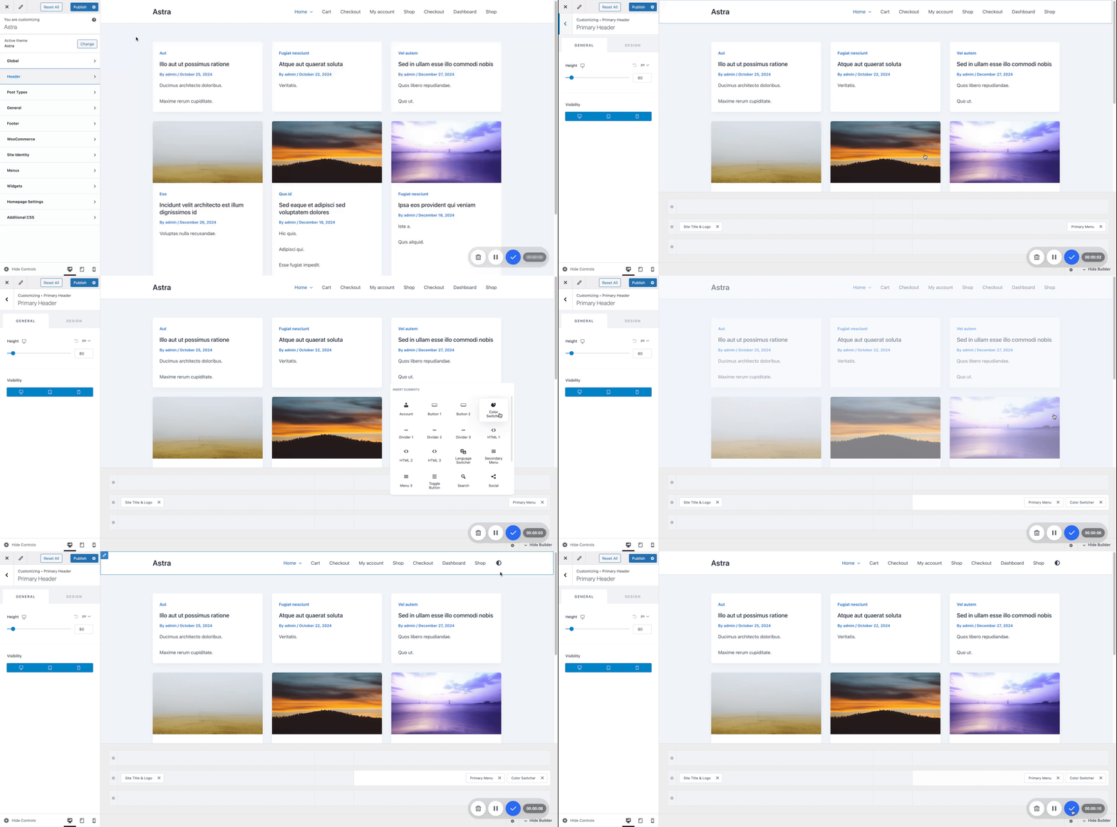
- Click on any available section in the header (e.g., Primary Header, Above/Below Header)
- Select Color Switcher from the available widgets
- The switcher icon will appear in the live preview

Step 3: Customize the Widget
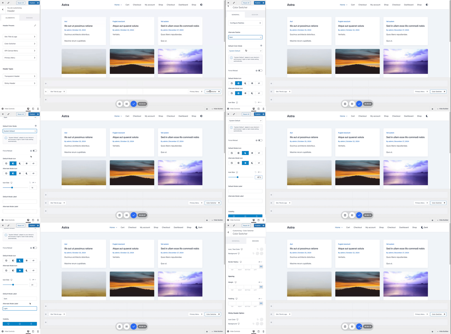
Once the widget is placed, you can customize:
- Alternate Palette – Choose the alternate Color Palette.
- 💡 Pro Tip: Use a darker color scheme in the Alternate Palette to offer a smooth Dark Mode experience!
- Dark Palette Behavior Options:
- Match OS Preferences – Automatically apply light/dark mode based on your visitor’s system settings.
- Force Page Reload – Reloads the page when switching modes for optimized performance.
- Icon Type – Choose a style like sun/moon, toggle, etc.
- Icon Size – Adjust to match your header style.
- Button Text – Optionally add custom text to display alongside the icon on the switcher button.
- Visibility – Show on desktop, mobile, or both.

- Design Options
- Icon/Text Color
- Backgrond
- Border Radius
- Spacing (Margin & Padding)
- Additionally, you can also customize the Colors of your switcher button in transparent sticky headers.
Why Use Dark Mode?
Dark Mode is one of the most popular uses of the Color Switcher. It helps:
- Reduce eye strain, especially at night
- Make your site more accessible and readable
- Give your site a modern and trendy feel
- Increase user engagement and retention
By offering Dark Mode through the Color Switcher, you’re improving your website’s usability without adding extra load or plugins.
Preview Your Changes
Once configured, click the switcher icon on your live site preview:
- Watch your color palette change instantly
- Make sure your text, background, and design elements look great in both modes
- Fine-tune as needed before publishing

Compatibility & Performance
The Color Switcher Widget is:
- ✅ Fully integrated with Sticky and Transparent Headers.
- ✅ Compatible with WooCommerce, LearnDash, Forms, and most plugins.
- ✅ Lightweight and performance-optimized.
- ✅ Built to work seamlessly with Astra’s Customizer—no conflicts, no bloated scripts.
Common Questions
Need a Visual Walkthrough?
We’re planning to release a walkthrough video for the Color Switcher Widget to help you set it up step-by-step. Once available, we’ll add the link right here—stay tuned!
We hope this guide has helped you understand how to set up and make the most of the Color Switcher Widget, including how to use it effectively as a Dark Mode toggle for your website.
If you have any questions or need further assistance, feel free to leave a comment below — we’re always here to help!
We don't respond to the article feedback, we use it to improve our support content.